
2.3.1 MAP 1 (Master map): Multi-scalar Map – A critical analysis of Kanten/The Edge competition
The main multiscalar map is divided into seven[111] major scales/network nodes, as shown in Figure 44 below. The maps span from the node at the top, which refers to the macro level – Global scale/network (in red) – to the node at the bottom, which refers to the micro level – Cyclic scale/network (in purple), as shown in Figure 44. These different scales are conceived from the viewpoint of a particular water body and its corresponding networks. For instance, the global water scale/network pertains to the global oceans, where the increasing ocean warming and acidification are impacting kelp to move to the colder waters of Scandinavia, representing the national scale/network level. Although the map is organised hierarchically in a verticle line, as shown in Figure 44, the connections between the various scales/networks are circular, highlighting that these scales/networks affect each other in a non-linear way. The different scales should be read more as a spectrum (a categorial fluidity). For instance, the agricultural runoff at a regional watershed scale/network level impacts the Vejle Fjord scale/network and then eventually flows to the larger water bodies of Danish national waters showing the interconnectedness of the different scales.
As will be apparent in section IV, in which I analyze the design entries of Kanten/The Edge competition, the main intention of Map 1 is to start the analytical journey from the smallest “6. Kanten/The Edge scale/network” level only to progressively go beyond the site of concern by zooming in and out through the different water scales/networks. Thus, the “6. Kanten/The Edge scale/network” node is highlighted as the biggest blue node, as shown in Figure 44 below.

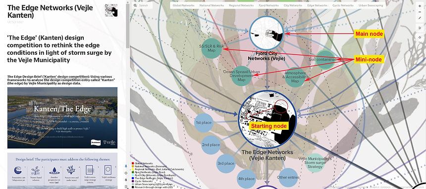
Figure 44. (Top image) Map 1 - Multiscalar map with the seven different types of scale/networks of water bodies bound by the four Urban Seascaping propositions. Each of the seven major scales (i.e. main nodes) is associated with “mini-nodes” that each contain various information that is relevant in aiding the analysis of Kanten/The Edge competition winning entries. The connection between the nodes is differentiated as direct connections/correlations are solid lines (coloured), and indirect connections/correlations are dashed lines (black). Each coloured circular node is embedded with maps, drawings, films, text and hyperlinks, which are shown in the left-hand panel that appears when you click on a node (as shown in Figure 45).
(Bottom image) Zooming into The Edge and Fjord City scale/network as the starting node and its associated mini-nodes.
Thus, each main node (scale/network) is connected (either by direct or indirect connections) to several corresponding mini-nodes hosting territorial maps based on various sources such as spatial data from GIS (see Appendix 1,
Table 5 for all the source references) and other visual mediums[112]. A QGIS program was used to layer different information, embedding these into the corresponding mini-nodes, as shown in Figure 45. For instance, Figure 45 shows a close-up of the National Scale/Network node with six corresponding mini-nodes (i.e. Danish waters map, pollution and protection map, land reclamation map, Economic values and coastal exposure map, more-than-human map, and state-of-the-art project map). Some of these maps are recreated through QGIS and Photoshop/Illustrator, and some are directly referenced from other sources.

Figure 45. Showing the progression of how to isolate and see the various levels of connections of each node in the Kumu map.
(Top row image) Showing the main national scale/network node and its corresponding mini nodes. By clicking on the mini-nodes, the left-hand panel displays related information, such as maps and drawings.
(Middle and Bottom row image) By clicking on the arrows on the right side, the user can isolate a node and its corresponding degrees of connection degrees or by hovering over the node with the mouse.
[111] Reason behind the choice of seven major scales: During the contextual analysis process (literature review), it was apparent that when considering the integration of marine life such as seaweed in Vejle, several factors outside of the immediate site of concern (i.e. Kanten/The Edge scale from the competition) determined the success of seascaping with seaweed as part of marine nature-based solution. For instance, global warming had an impact on the chance of survival, stretching the site of concern to a global scale, while at a micro/cyclic level, the unbalanced food web in Vejle Fjord of exploding crab population had an impact on the survival of seaweed (as food for crabs). Therefore, the global and the seaweed (micro/cyclic) scale/network determined the maximum and minimum ends of the multi-scalar approach. Moreover, the national scale/network became relevant as the aim of the research contribution is to be able to be applied to other contexts in Denmark and that urban development model for coastal cities in Denmark have followed a similar path. The regional watershed/catchment scale became an important scale as it determined the source of water pollution and its influence on the corresponding water body (i.e. Vejle Fjord). Seeing Vejle Fjord along with its river valley as a whole became an important scale/network to consider as implementing marine nature-based solution required interventions upstream (i.e. river and streams) to catch the pollutants before they entered the fjord, and certain types of seaweed (i.e. kelp) required deeper waters of the mid-outer fjord for them to grow. Finally, Vejle’s Fjordbyen and Vejle’s Kanten scale/network was due to the result of working with Kanten/The Edge design competition.
[112] Such as texts, diagrams, drawings, videos, territorial maps, animated GIFs. Animated GIFs are used to show the various associations and changes between different factors that influence a particular territory. For instance, the pollution and protection map in Figure 45 (in Kumu map) is an animated GIF that changes from coastal water pollution to phosphorous concentration on land and nitrogen concentration on land due to agricultural activity.